Market Basket
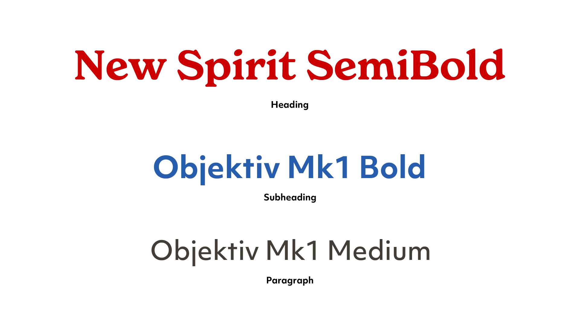
DeMoulas Super Markets, known as Market Basket, is a supermarket chain local to New England. They provide local communities with high-quality, affordable products, as well as career opportunities. The outdated look of the current branding system lacks flexibility and severely limits the success of the brand. I propose an updated solution, one that is bold, timeless, and reliable. The typography, iconography, and color were all important to the success of the implementation and together produced a new, innovative look.
Industry
Retail
Grocery
Services
Brand Identity
Brand Strategy
Stationery
The redesigned Market Basket logo blends tradition with modern functionality, transforming the company name into the shape of a shopping cart. This approach reinforces the brand’s identity while creating a dynamic, instantly recognizable mark. The bold red and blue color scheme maintains familiarity, while the refined typography ensures versatility across digital and physical applications. This new logo serves as the foundation for a cohesive and refreshed visual strategy.


The rebrand extends beyond the logo into a cohesive set of product and environmental graphics, reinforcing Market Basket’s refreshed identity. From soda can designs to shipment truck decals, every detail was carefully considered to create a bold yet approachable visual presence. The updated shopping bags, uniforms, and promotional materials ensure brand consistency, making the new identity seamlessly recognizable across all customer touchpoints.
The Market Basket website and app redesign modernize the shopping experience while staying true to the brand’s heritage. Clean layouts, intuitive navigation, and a balanced color palette create a seamless digital experience for customers. From browsing weekly deals to managing grocery lists, every interface was designed with convenience and accessibility in mind, ensuring a smooth and engaging user journey.


