How can a film festival’s design and curation encourage audiences to examine and discuss class across cultures?
MORE ABOUT THE PROJECT
CONTEXT
mezzanine is an annual international film festival held across multiple venues in the Boston area. The festival uses cinema as a way to examine class across cultures, encouraging audiences to think critically about how social and economic divisions shape people’s lives and to continue those conversations beyond the screen.
Each year, mezzanine focuses its programming on a different country. This creates a new cultural lens through which audiences can consider class while still recognizing experiences that extend beyond one place. The 2026 festival focused on South Korean cinema, with a program of films spanning different genres, decades, and perspectives on class.
CHALLENGE
I was tasked with developing the identity and campaign for the 2026 festival while building a system that could continue to evolve with mezzanine in future years. Because the featured country changes annually, the identity could not depend too heavily on visual references specific to South Korea. It needed to belong to mezzanine first.
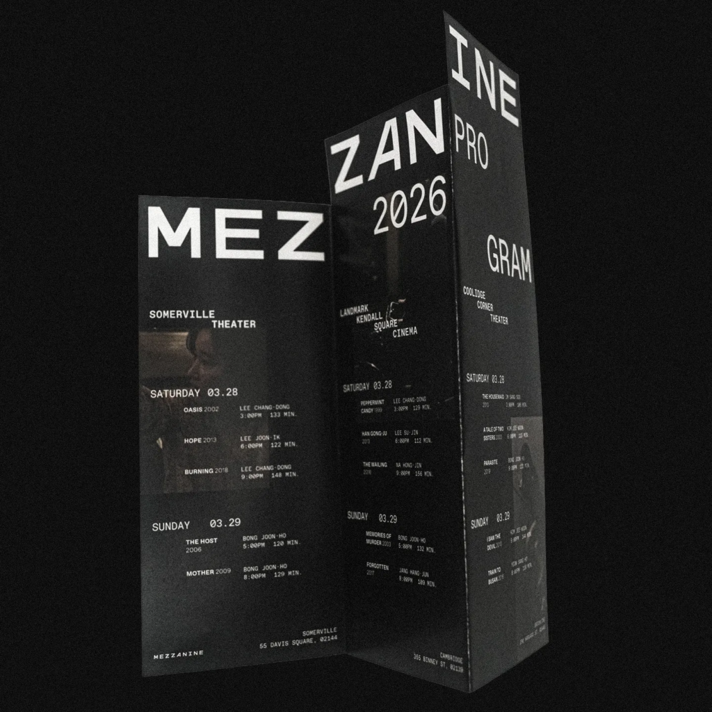
The festival also required a system capable of handling very different kinds of information. Film titles, screening schedules, editorial content, venue details, and multiple languages all needed to coexist without losing clarity. At the same time, the identity had to remain recognizable across everything from a small ticket to a large-scale outdoor advertisement.
SOLUTION
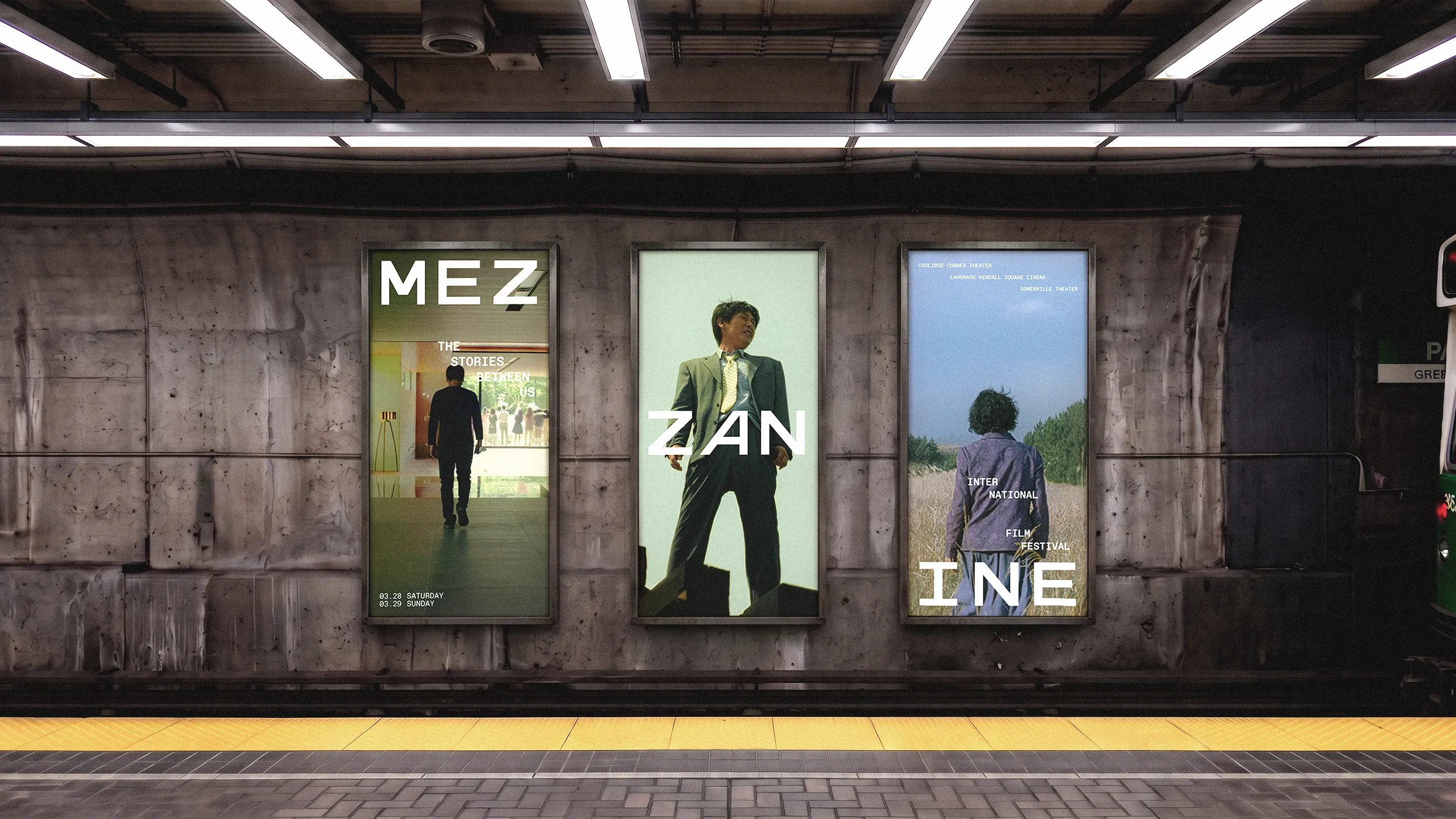
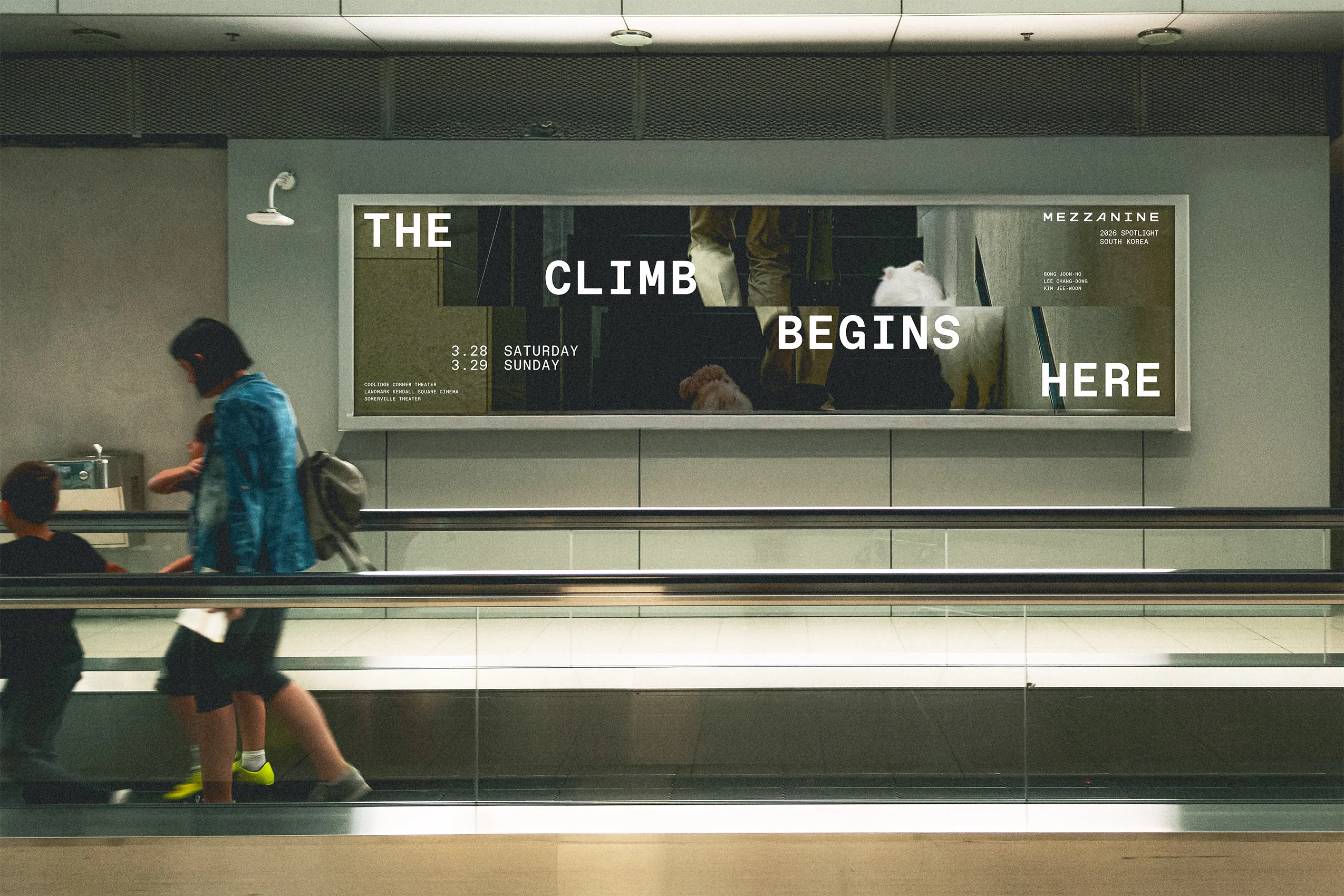
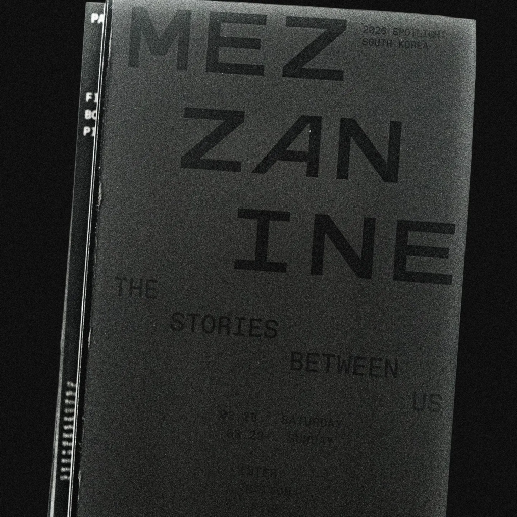
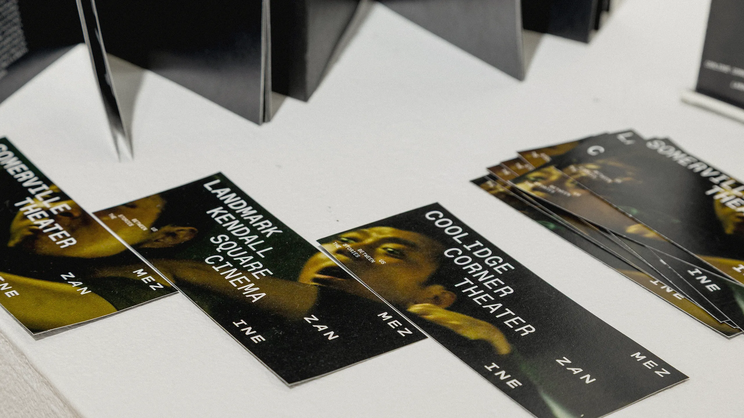
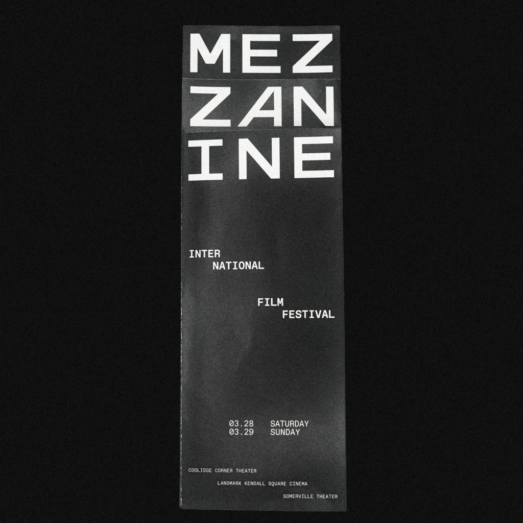
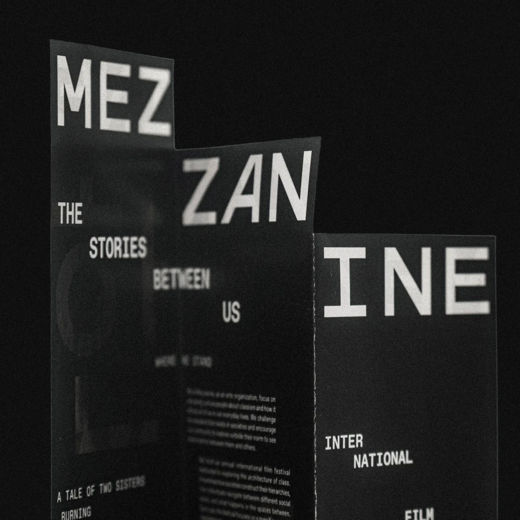
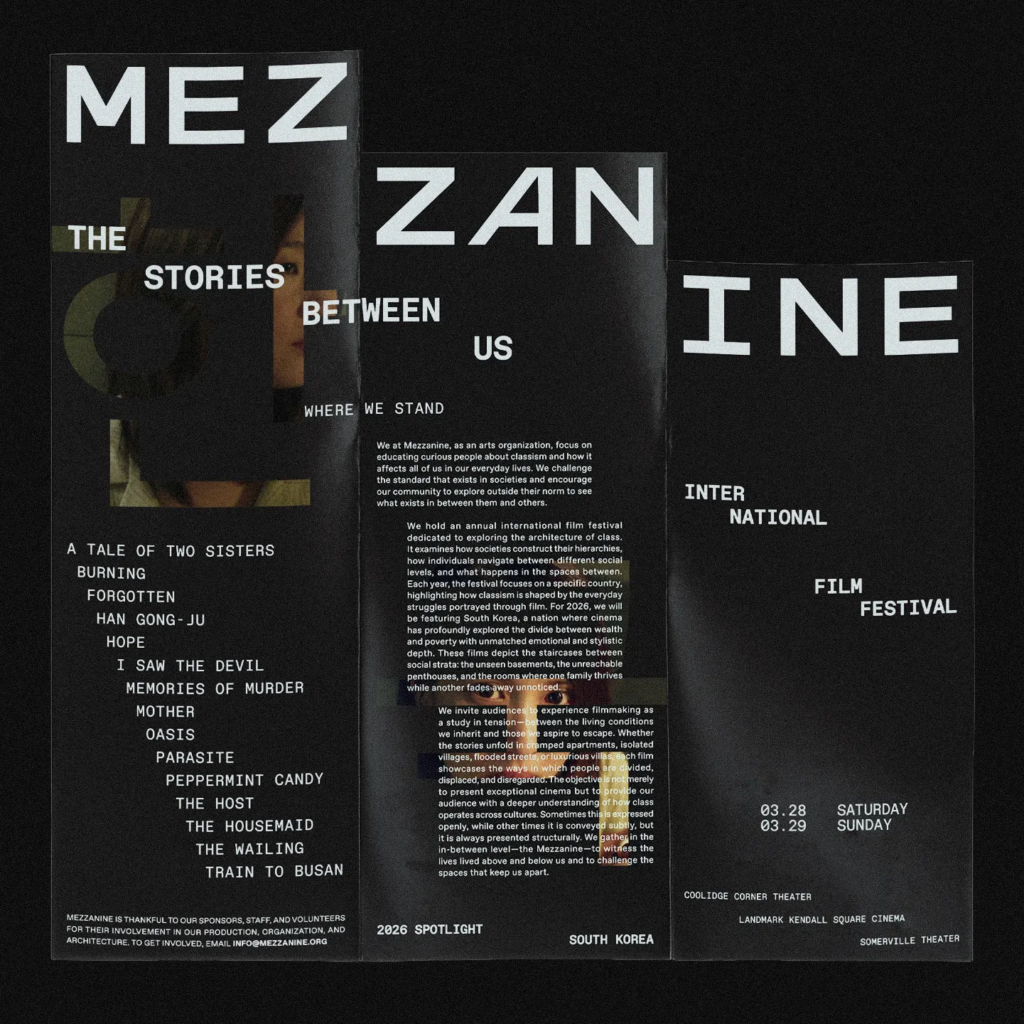
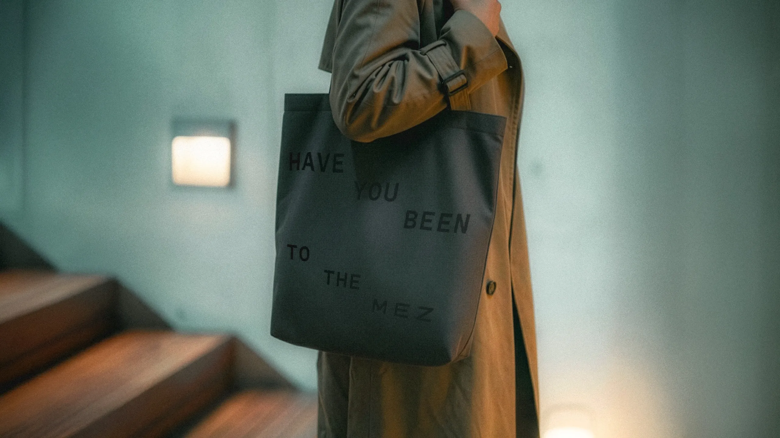
The identity grew around the staircase, a recurring motif that became both a visual structure and a metaphor for class. Stairs suggest movement between levels, but they also make hierarchy visible. Throughout the system, the motif appears through stepped typography, image placement, framing, and shifts in scale. Sometimes the staircase is immediately recognizable; elsewhere, it is reduced to a more abstract compositional device. This allowed the idea to remain present without turning every application into a literal illustration of class.
The rest of the identity stays intentionally restrained. Film stills carry much of the emotional weight, while typography adds texture and establishes a consistent framework around them. The visual language leaves room for individual films to feel distinct while still placing them within the larger world of the festival.
Dinamo’s Favorit became the primary type family because it could support that flexibility. Its broad range of styles, glyphs, and language support made it practical for an international festival whose featured language changes from year to year. Favorit Mono became especially important to the identity because its fixed-width structure allowed me to create tiered compositions and experiment with typographic form while maintaining legibility.
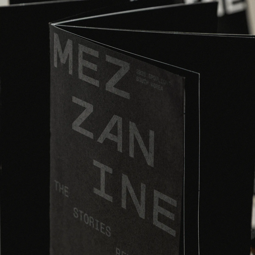
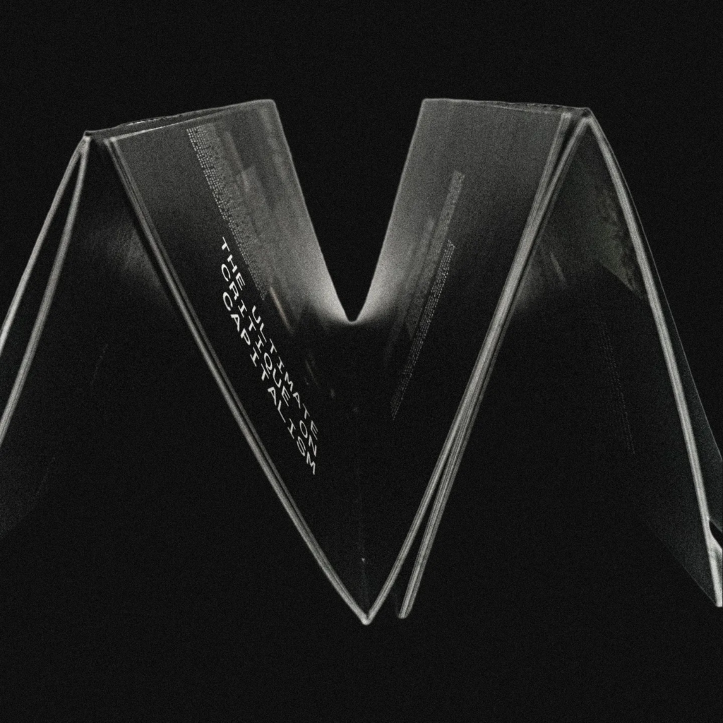
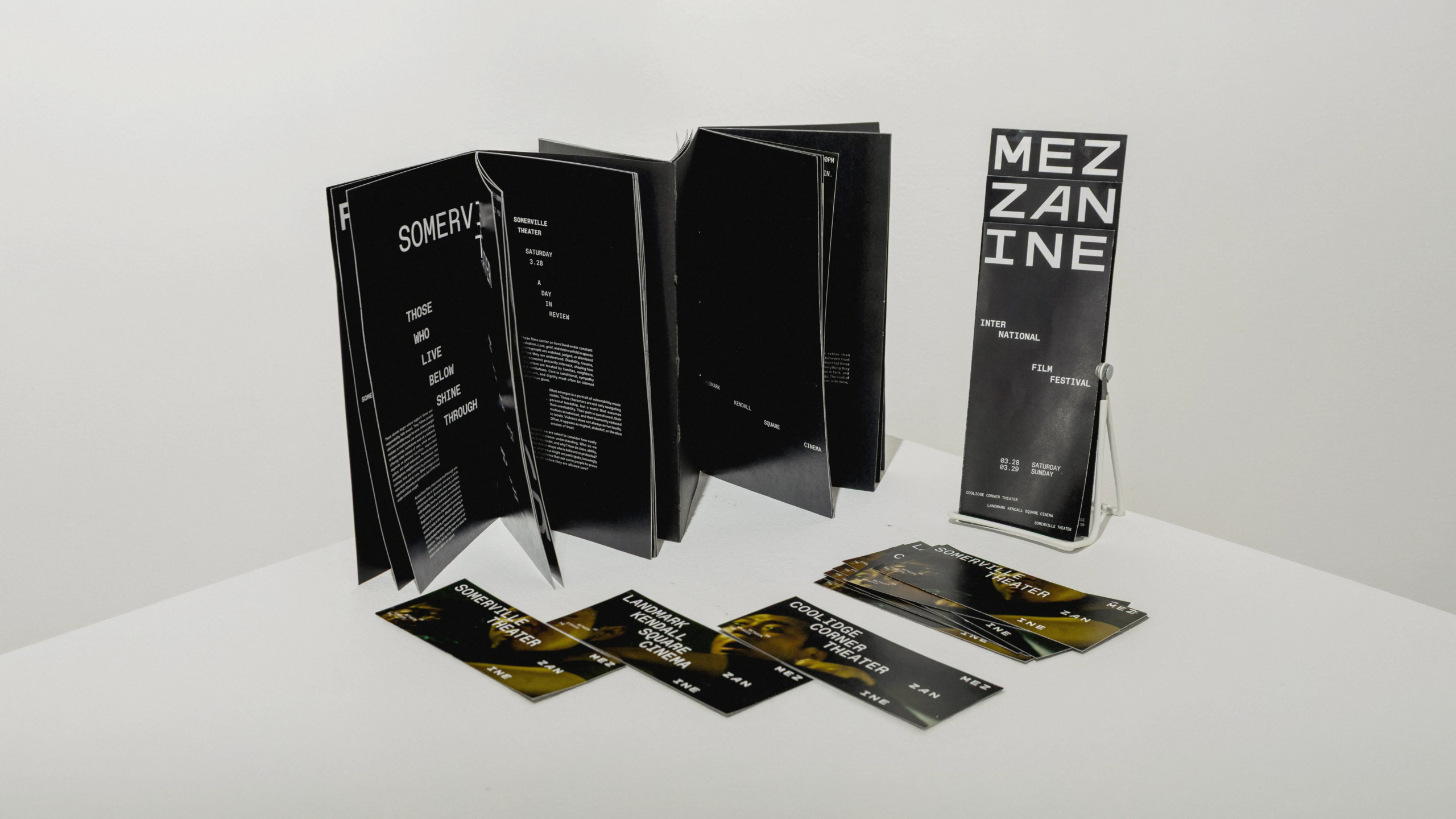
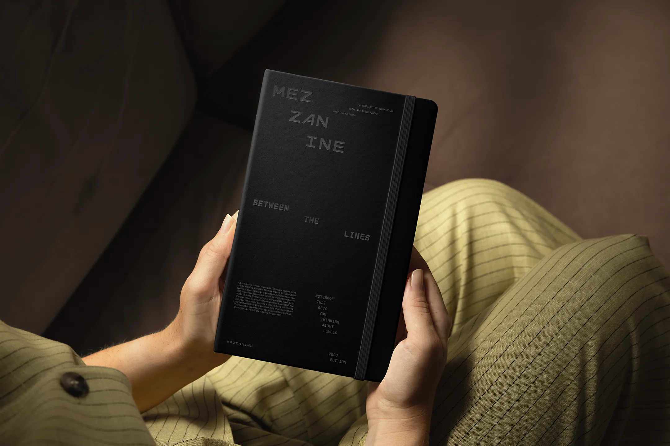
The final identity extends across the festival logo, film bumper, pamphlet, booklet, tickets, out-of-home campaign, and merchandise. Across each application, the staircase acts as a connecting thread, helping the festival’s larger conversation around class remain embedded in the design rather than existing only in its written messaging.
CONTEXT
CHALLENGE
SOLUTION
mezzanine is an annual international film festival held across multiple venues in the Boston area. The festival uses cinema as a way to examine class across cultures, encouraging audiences to think critically about how social and economic divisions shape people’s lives and to continue those conversations beyond the screen.
Each year, mezzanine focuses its programming on a different country. This creates a new cultural lens through which audiences can consider class while still recognizing experiences that extend beyond one place. The 2026 festival focused on South Korean cinema, with a program of films spanning different genres, decades, and perspectives on class.
I was tasked with developing the identity and campaign for the 2026 festival while building a system that could continue to evolve with mezzanine in future years. Because the featured country changes annually, the identity could not depend too heavily on visual references specific to South Korea. It needed to belong to mezzanine first.
The festival also required a system capable of handling very different kinds of information. Film titles, screening schedules, editorial content, venue details, and multiple languages all needed to coexist without losing clarity. At the same time, the identity had to remain recognizable across everything from a small ticket to a large-scale outdoor advertisement.
The identity grew around the staircase, a recurring motif that became both a visual structure and a metaphor for class. Stairs suggest movement between levels, but they also make hierarchy visible. Throughout the system, the motif appears through stepped typography, image placement, framing, and shifts in scale. Sometimes the staircase is immediately recognizable; elsewhere, it is reduced to a more abstract compositional device. This allowed the idea to remain present without turning every application into a literal illustration of class.
The rest of the identity stays intentionally restrained. Film stills carry much of the emotional weight, while typography adds texture and establishes a consistent framework around them. The visual language leaves room for individual films to feel distinct while still placing them within the larger world of the festival.
Dinamo’s Favorit became the primary type family because it could support that flexibility. Its broad range of styles, glyphs, and language support made it practical for an international festival whose featured language changes from year to year. Favorit Mono became especially important to the identity because its fixed-width structure allowed me to create tiered compositions and experiment with typographic form while maintaining legibility.
The final identity extends across the festival logo, film bumper, pamphlet, booklet, tickets, out-of-home campaign, and merchandise. Across each application, the staircase acts as a connecting thread, helping the festival’s larger conversation around class remain embedded in the design rather than existing only in its written messaging.